When asked how the lettering of a comic helps tell a story, Britt Wilson laughs, then gives fair warning.
“You overestimate just how much I think about what I’m doing.”
That isn’t to say she doesn’t take it seriously, at least some of the time.
Wilson is a Toronto-based illustrator, who has done everything from illustrating book covers to lettering for a run of the wildly popular Adventure Time comic series. She has even taught classes about comics at Little Island, the kid-focused younger sibling of Toronto comics hub The Beguiling.

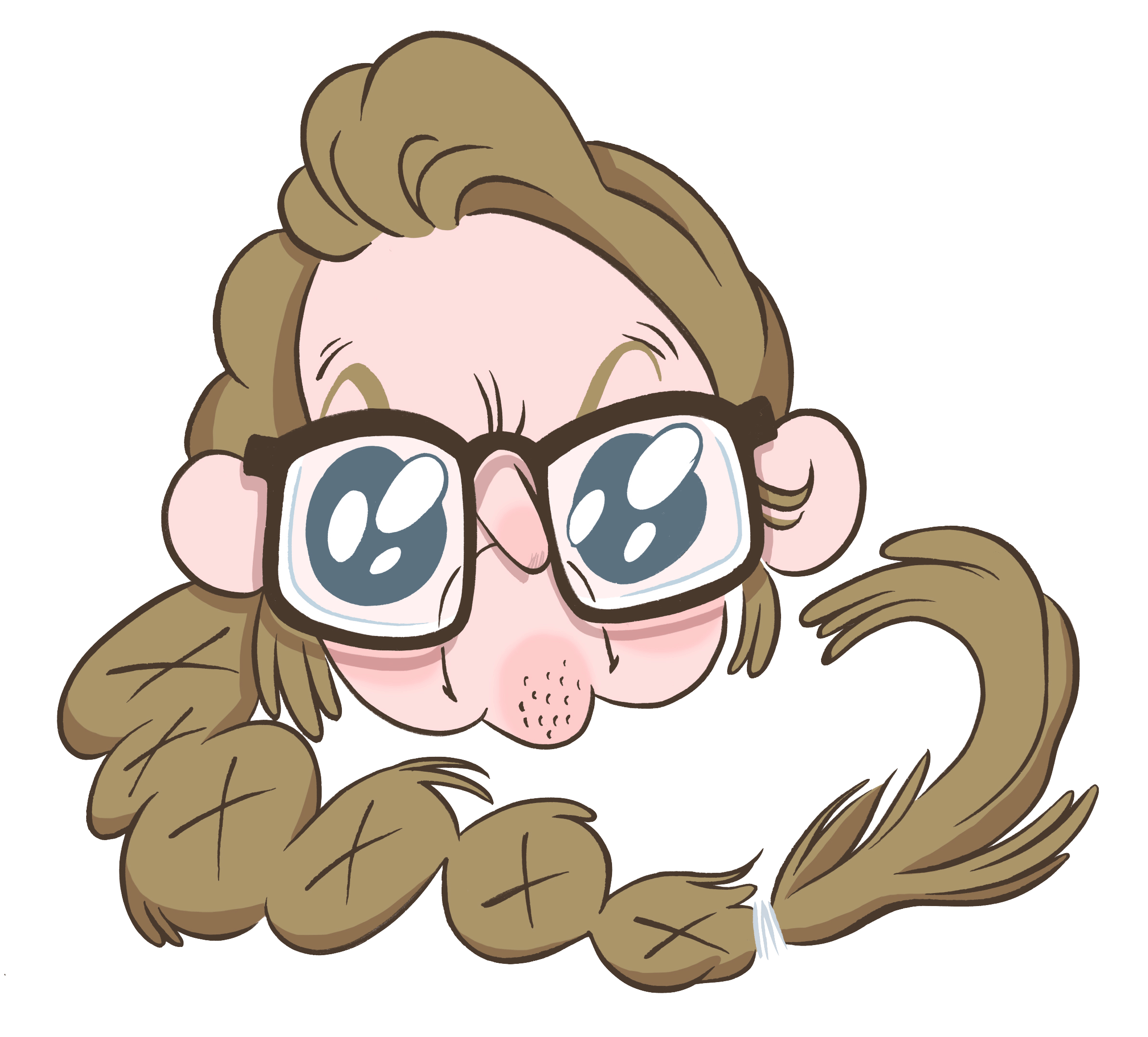
ILLUSTRATION COURTESY OF BRIT WILSON
Wilson does work that involves either only lettering or only illustration — her job on the Adventure Time issues, for instance, is just lettering — but she explains that they constitute an organic whole. “I’m still pursuing both of them pretty heavily… I do a lot of cartooning and graphic novels right now, which has also led me to do more lettering, because as I do more lettering for [my projects], people are seeing it and wanting it for theirs.
“I would never want to give up one or the other. I love them both equally… They’re one and the same for me.”
Wilson’s stylistic integration of lettering with illustration is a large component of her success. Her style is whimsical and bouncy, hence the appeal of her work to children, but it’s not without an edge. “It’s hard because I love swearing. I actually was trying to think of a pseudonym for my kid’s things because I do love doing children’s things… But I hate that I can’t swear in front of children and that there are only so many potty jokes that are appropriate for the under-nine crowd.”
This consistency in visual style is present, but it isn’t really a conscious decision, nor is it Wilson’s primary aim. Whether she’s working on comics, illustrations, or editorial cartooning, her work is united by what she calls a ‘current.’ “It’s not something that I think about consciously, but it does come though… I don’t necessarily try for it, it just happens.”
The process isn’t smooth, though. The answer to a question on how often Wilson hits a creative block comes immediately: “Oh my God, every day,” especially recently as she has been working on a graphic novel, which she has to write scripts for. Wilson’s studio is in her apartment, and long hours working in a room with only her cat for company can make an outside voice the key to breaking the block. Sometimes the key to a breakthrough is walking away, or simply showing the work to someone else. Creative blocks happen more rarely with lettering, though, which “tends to just go.”
Wilson isn’t the only illustrator and letterer for whom things seem to flow organically. Zach Worton, another Toronto cartoon artist, has his own reasons for being organic.
“Everything doesn’t need to be perfect all the time. It’s, y’know, I think comics are, they have their own life. I don’t think they’re just drawings and words on a page; there’s something way more to it than that. And I think when people try to make it too perfect it becomes disingenuous, to me.”

ILLUSTRATION COURTESY OF ZACH WORTON
In 2011 Drawn & Quarterly published Worton’s longest work to date, The Klondike, a set of fictionalized, interwoven stories about the Klondike Gold Rush that took place in the Yukon at the end of the nineteenth century. The comic was popular with a niche crowd, drawn in by historical interests and Worton’s unique take to storytelling. “It’s not an action-packed adventure story western. It was told very deliberately as a historical book. History isn’t always exciting… I didn’t want to make it something that it wasn’t. I feel like there was enough action, enough tension in it to be compelling.”
Worton’s careful approach shows in his work. His illustrations are tight and meticulous, though crowded when they need to be. By his own admission Worton’s style is heavily influenced by European artists like Hergé or Mœbius. It shows in his lettering too. He writes in clean, capital letters, except for the errant “i,” which is consistently lower case. Sounds such as yelling or loud noises (like gunshots) are represented by larger variations on the same lettering style, sometimes using double lines for emphasis. Worton’s letters are shaped in the same fashion as his stories are, to portray what is necessary. They’re meant to tell stories as they are.
Worton and Wilson both work by hand, and find that it brings a higher calibre of artistry to the final product. While Wilson knows artists who do amazing digital work, and though she occasionally uses digital means to speed up her process, she finds that working digitally detracts from the satisfaction she gets in creating her work. “I’ve played around with doing vector lettering either by just altering an existing font or by drawing something and tracing it into illustrator. It’s just that I feel less organic, I feel less involved in it. And I’m always …not in love with the final.”
Worton, meanwhile, voices concern for how the reader experiences digital lettering that is juxtaposed with clearly analogue visuals. “You can tell when something is done by a computer. It’s too perfect, it’s too clean. There’s no real heart in it, I feel. It’s a cold bunch of pixels printed on a page..If you look at any comic you’re going to find imperfections always. Giving it the illusion that it’s something that it’s not is doing it a disservice.”
Good lettering plays one of two roles. It either communicates with the audience by becoming invisible, allowing the actual text and pictures of a piece to resonate, or it stands on its own, adding emotion or a mood to an otherwise boring typeface. Both of these roles mean working with the rest of a comic, either by blending in or by sticking out. The best thing anyone can do to realize this is simply to look closely. As Wilson puts it, “I think the graphic novel and the lettering are very important. One isn’t necessarily more important than the other…It’s worth paying attention.”