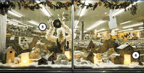
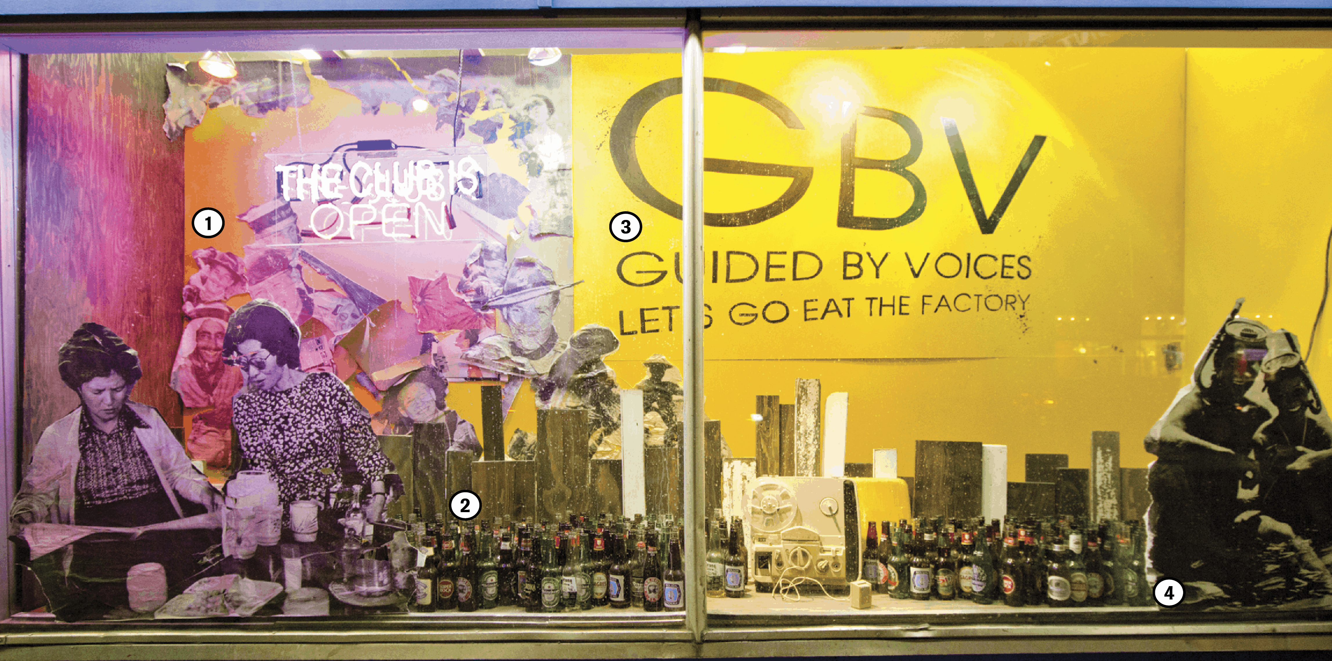
If you’re a storefront designer in Toronto, rare is the opportunity to fill a half block–spanning window with something as eccentric as a giant abominable snow bird — unless you work at Sonic Boom. The record shop features a different album every month and is known for its quirky, iconic windows, designed by Tim Oakley. Sonic Boom’s storefront designer for the past seven years, Tim Oakley gave The Varsity the lowdown on what exactly goes into designing the storefront installations…
***
① After choosing Guided By Voices as the featured band of the month, the next step is to study the album cover and break it down. “Yellow and wood were the main reference colours here, with [a few] weird splashes of white. It’s a pretty simple, minimal cover … Robert Pollard is a big collage guy — all of their covers are sort of ripped out of National Geographic so I tried to use one of his signature [styles].”
② Though Sonic Boom doesn’t approach its displays from an advertising perspective, the store does have some techniques to attract the customers’ attention. “Sometimes I think if it’s a classy window they don’t do as well as if it’s a little scrappy in some way. Somehow, slickness just makes it fade into the architecture of the building.” Tim added a three-dimensional touch by filling the bottom with beer bottles, giving the window depth, and referencing the fact that Guided By Voices is a notorious party band.
③ The next step is making the window installation unique to Sonic Boom. “I try to think if there’s anything [new that I] can add. I try to encourage myself to develop new techniques if time and money allow. We found out that when GBV play live, they have a sign that says, ‘the club is still open,’ which is a lyric from one of their songs. We ordered one of those from the States — it has nothing to do with the album cover, but anyone who’s a fan of the band will get it.”
④ Constructing the storefront is as much about practicality as it is about design; all four walls must be accounted for, along with the floor and ceiling. “That’s the hardest part; if I like something [for one wall], then I have to start thinking about how I’m going to do the rest of [them]. That’s always been the struggle.” It just takes a small detail to bring an installation together. Tim fleshed out the rest of the GBV installation by adding a few non-specific ’80s records.
***
⑤ On the festive side of things, the Sonic Boom holiday window was not inspired by an album, but rather, a few happy coincidences. The displays often feature one object or element that takes the bulk of the display. In this case, it is a massive bird. “I don’t even know how I came up with it. A friend made me make a bird mask a couple of years ago… Then I was making this Santa’s village, it sort of had no plan, and everyone was like, ‘Hey, bird houses!’ so I was like, ‘Okay, I’ll put some birds on it — that was fully intentional.’

WYATT CLOUGH/THE VARSITY
⑥ Piece by piece, the random fixtures find a place and a theme comes together. “I didn’t want it to be so Christmas-specific, especially now that we’re in Honest Ed’s and that’s their thing… So I made it this mythical Christmas; kind of like a 1600s Scandanavian interpretation of it. Maybe [the bird] is their Santa.” Typically, the displays take a couple of weeks to build. In the new location, Tim’s job also includes constructing walls and a great deal of carpentry — and then there are the little things. “Every one of those feathers I had to hand-glue onto him, and it took days. I actually gave up — that’s why he’s wearing a sweater.”


