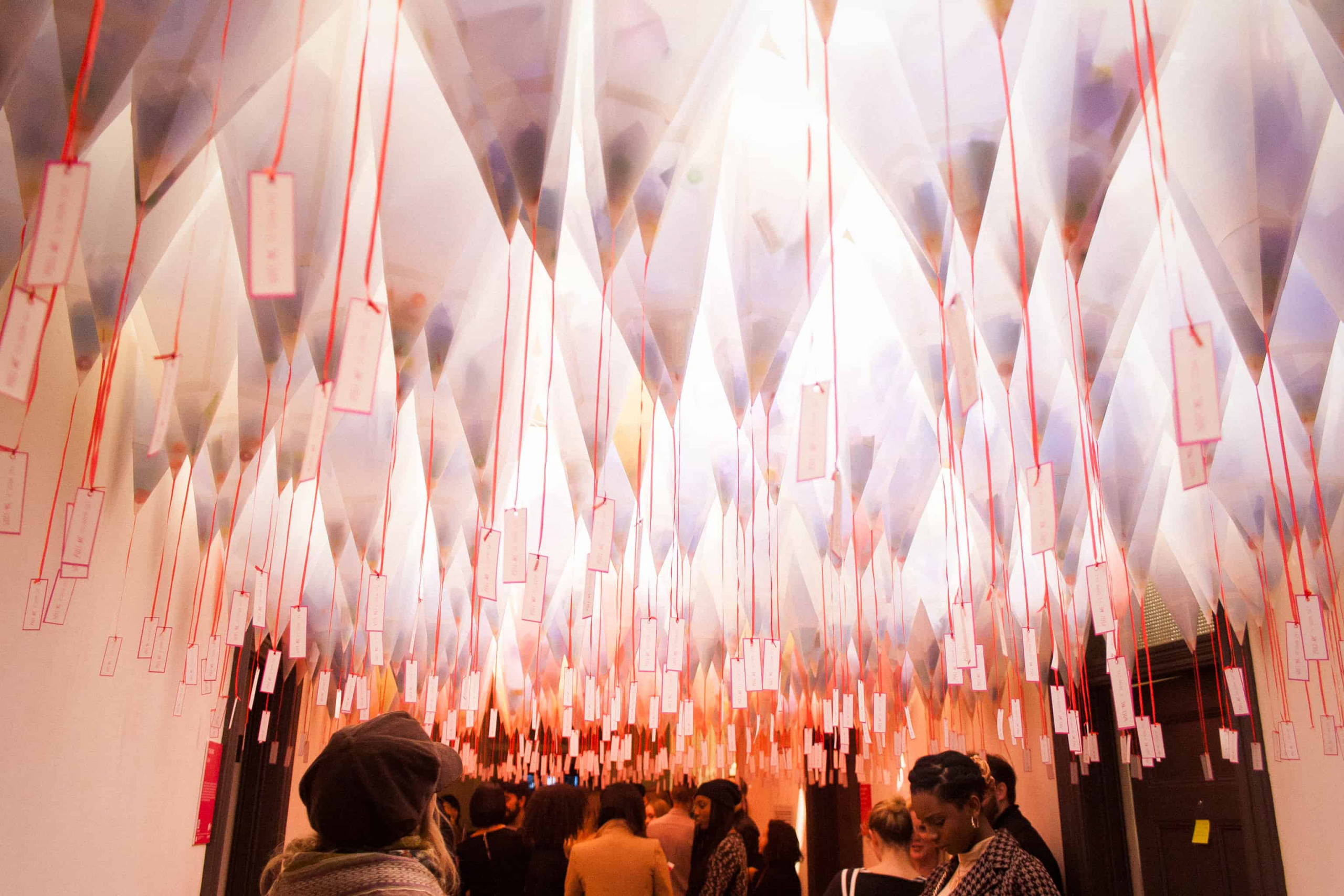
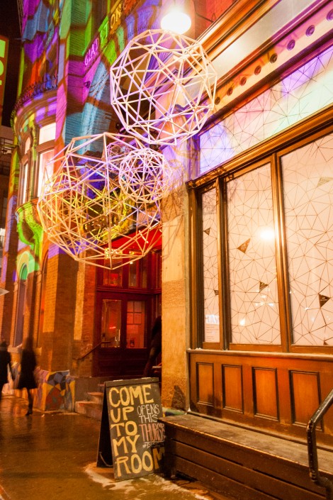
Last Thursday, the Gladstone Hotel opened up its doors for its 11th annual alternative design show Come Up To My Room (CUTMR). The event showcased the work of 60 artists and designers which manifested itself in 25 different installations thar provide viewers with a glimpse into the ideas, risks, and new paths that current Toronto The show really begins outside with the exterior installation piece, “Escapespace,” a series of skeletal wooden balls constructed with multi-coloured stick-like fragments. It’s meant to represent the city and the individual’s disconnect from their daily realities and the environment to retreat within our personal spheres. “Escapespace” did an excellent job at introducing readers to the notions of privacy, individuality, community, and commonality associated with the concept of a room. The exhibition took place primarily on the second floor, where every corner was transformed with artists’ work from the room installations to the wooden bar table. This immersion in installation coupled with the uniform enthusiasm and energy of the visits made the second floor appear like a type of impromptu performance piece itself. The room was flooded with people eager to examine the rooms and see how the artists had transformed the hotel and how they worked with the concept of room. Only a few of the rooms were actually used for installations, which some visitors discovered through a trial-and-error process which sometimes ended up with a mistaken invasion of certain office spaces.
Room 214 housed one of the more popular exhibitions, “Fall of the Walled Garden” where visitors are asked to take off their shoes and sit around the periphery of a room filled with alternating coloured lights and calming ambient music. A synthetic, wool-like material enveloped the space from floor to ceiling, creating a clean, comfortable, and calming space. From the ceiling, sheets of this same raggedy but gentle material hangs from the ceiling, extending closer to the ground as it gets to its longest in the centre of the room. The very centre of the ceiling is left bare and is surrounded by this white material. Beneath this empty space is a stool, dressed in the same material, on which people would sit and isolate themselves within the hanging cave. The work was meant to immerse viewers in an introspective experience in a public space and beautifully accomplished this. Other notable pieces were in rooms 201 and 207. Room 201, “Get Out of My Room,” was a model of a teenager’s bedroom, showcasing the anxieties of being on the cusp of adulthood. The latter, “Gut Feelings,” was a room meant to investigate and immerse the viewer in “the social, psychological, and sexual aspects of corporeal politics, body perception, and body image.” The artist, Shannon Scanlan does this by carefully arranging a group of uneasily fluorescent cushions that take the form of body parts, specifically intestines, to achieve this goal. The beauty of the show is that, regardless of whether artists’ aims are immediately evident or not, their work still creates an impact and can be appreciated for its raw craftsmanship. This makes the show ideal for anyone to attend, art lover and liker alike.


