One of the current exhibits at the Gladstone is the much-hyped If Walls Could Talk, an illustration exhibit that has called on Canadian artists to submit their work. The project was juried by an impressive group of illustrators and creative directors, and submissions were accepted from emerging as well as established artists. Initially much about this project seems well done, from the approach they first took, down to their branding; the logo design is the clean and attractive acronym IWCT, with each letter in a custom font type.
 Curator Leila Courey looked to explore illustration as a discipline and to challenge the artists within their own work. If Walls Could Talk features both two- and three-dimensional works on a variety of media. The exhibit spans the public space and several rooms of the second-floor gallery and can be explored in any order. One of the first pieces is a large wall-mounted sculpture by Toronto-based artist Kerry Zentner. It is a large black square with a circular illustration in the middle, suspended by black sculpted hands reaching outwards. The illustration is elaborate and colourful, albeit somewhat unsettling, as fantastic and supernatural creatures are surrounding a human in a way that can only be seen as menacing.
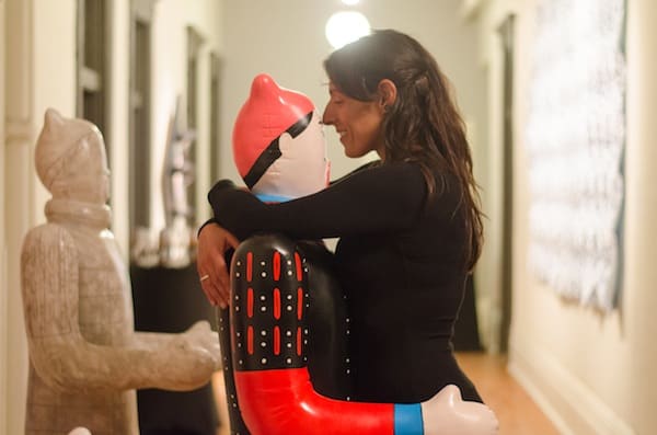
One of the largest installations, and the second I came across in my walk through, are three near-life size statues meant to resemble both Chinese Terracotta Warriors and blow-up sex dolls. The artist, Korean-born Min Gyo (Daniel) Chung, aims to question themes such as the repetition of history, the absurdity of mass production, and human efforts to manipulate life. The pieces are attention-grabbing to say the least, but undeniably strange to observe and think about. On the opposite wall is a large, contoured piece of sheet metal. It is hanging above eye level and is painted white with blue polka dots. It is one of the more pleasant pieces in the exhibit and also reflects artist P.K. (Adam Hilborn)’s professional background in branding and industrial design.

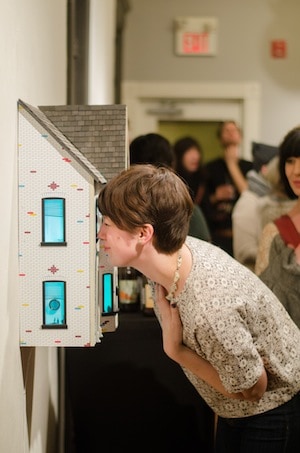
Two pieces around the corner provide interpretations of what the inside of a home can look like. One piece, “Face Hole” by Beata Kruszynski, is a shadow box into which the viewer physically sticks their head to look around. They see three illustrations of people, featuring cats, as well as small cat toys scattered around the bottom. The other work is “Room for Rent” by Mike Ellis. His piece looks like a hand-drawn dollhouse, with magnifying peepholes in each window allowing you to look into the rooms. Inside you can see his illustration of the different rooms, all while the house is shining different coloured light. The room illustrations are messy and comical, yet hard to examine closely because of the array of neon.
This is merely a sampling of the exhibit, which was conceptually very interesting and engaging. Next to another two paintings there is a plugged-in hairdryer and a sign saying that the works are heat-sensitive and waiting to be manipulated. The variation of media and message is very impressive, and yet the exhibit is often hard to follow. I came to the exhibit with minimal understanding of what “experiential illustration” is, and left only with a strong desire to sit down and eat a croissant at the downstairs café. The artists’ messages are comical at points, but simultaneously felt very dismal. The pieces are fun but lacking in a cohesive message, other than all being very specific manifestations of the artists’ own domestic visions.


