U of T is seeking a replacement for its aging Portal, which is currently offered by Blackboard.
The Academic Toolbox Renewal is an initiative launched under the sponsorship of Vice-President Innovations in Undergraduate Education Susan McCahan and Vice-President University Operations Scott Mabury; it seeks a comprehensive digital solution for the needs of instructors and students, with the new Learning Portal being the backbone of this initiative.
“Feedback from the University community is that the web interface for the Portal is clunky and out of date, and it doesn’t flow the way people would like,” reads a portion of the Academic Toolbox Renewal website. “It’s also hard for instructors to incorporate new tools into their teaching.”
Three companies — Blackboard, Desire2Learn, and Instructure — are vying to become the supplier for the new Learning Portal. Each held live presentations on campus during the summer. The testing period for the companies’ offerings has begun. Another round of presentations in late fall will occur before a final supplier is chosen in December.

Desire2Learn
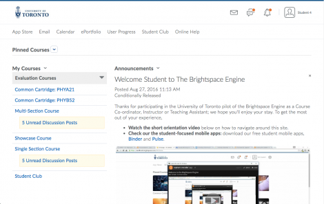
Brightspace, developed by Desire2Learn, has a simple, all-white look to it and is personalized by containing the U of T logo in the top left corner, unlike Blackboard, which displayed its own logo in the top left corner. It also gives users the ability to pin specific courses to appear at the top of the screen, however, this feature takes up a large amount of the screen space causing users to have to scroll down in order to see the current announcements.
Brightspace comes with thorough analytic tools that not only allow students to see how well they are doing in their course but also allow professors to see how much time their students are spending on the portal. Additionally, the service is capable of alerting professors to which students are struggling the most in order to recommend one-on-one meetings. Brightspace allows professors to have these one-on-one meetings with a student through the portal using a built-in video calling application. This application also gives the professor the option to make their announcements through a video announcement rather than a text.
Much like Blackboard, Brightspace also has a mobile app, however, the app is not simply a port of the browser version like Blackboard’s. The Brightspace mobile app is called Pulse and looks visually similar to an agenda, with a strong focus on analytic tools. Lastly, Brightspace has its own app store that students and professors can install on their portal for access to new functions.

Blackboard
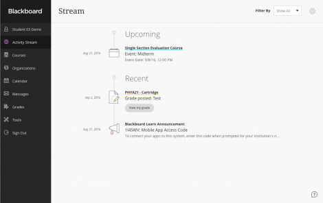
Blackboard’s new offering presents a more minimalistic and modern design compared to the current Learning Portal. Once signed in, the website opens up its new activity stream page, which gathers any new announcements, upcoming assignments, or recently uploaded grades and places them in a vertical timeline.
By doing so, it allows students to quickly remind themselves of approaching deadlines, while being able to see if there is any other important information that needs their attention. Additionally, the activity stream is customizable, allowing students to filter the notifications that show up in the timeline.
Another new feature to Blackboard’s portal is the way new content is opened; users can slide out of a display from the right side of the screen onto another layer, rather than opening up a new window. This prevents students from having to click the back button after viewing an announcement to return to the main page or having to wait for new pages to load. The new Blackboard is also filled with analytic tools and the ability to save automatically while working on it.
The most powerful aspect of the Blackboard system is their mobile app, which underwent all the same changes the browser version went through as well, making it run more efficiently.
Instructure
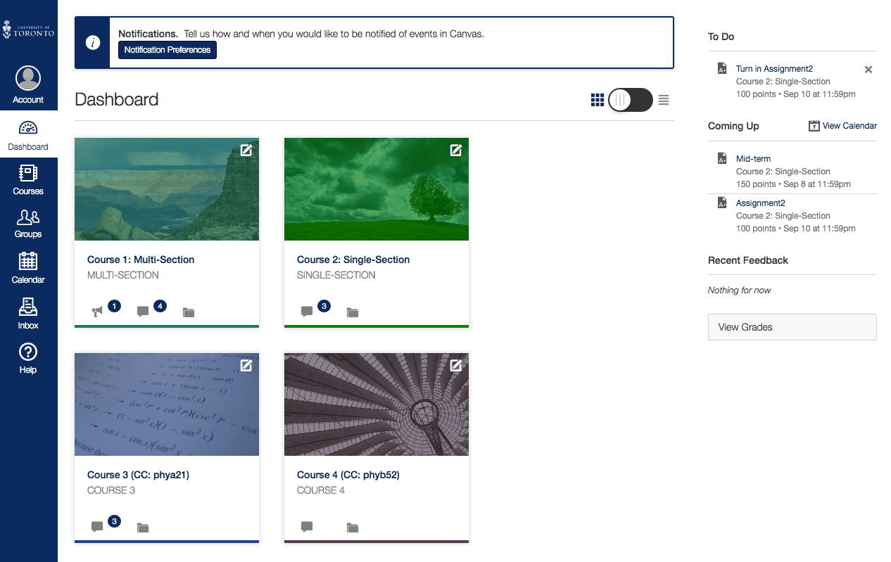
Canvas is a portal system developed by Instructure, which has also been personalized with the U of T logo in the top left corner and the university’s white and blue colours. Similar to Blackboard, it has a minimalistic look with a left-sided menu, allowing users to quickly switch between the dashboard, courses, and calendar.
The courses tab also has a slide-out function that releases a new layer containing a list of the users’ current classes. Similar to Brightspace, the Canvas dashboard has the course title and visual thumbnails on the screen to click on, but puts the announcement section on the top right of the screen, avoiding the scrolling issue that Brightspace users may experience.
Canvas also offers distinct mobile apps for use by students and faculty, and an app designed for use on iPad. Canvas also has a calendar that shows all upcoming assignments and reminders.
Editor’s note: A previous version on this article incorrectly stated that Canvas does not include mobile applications.


