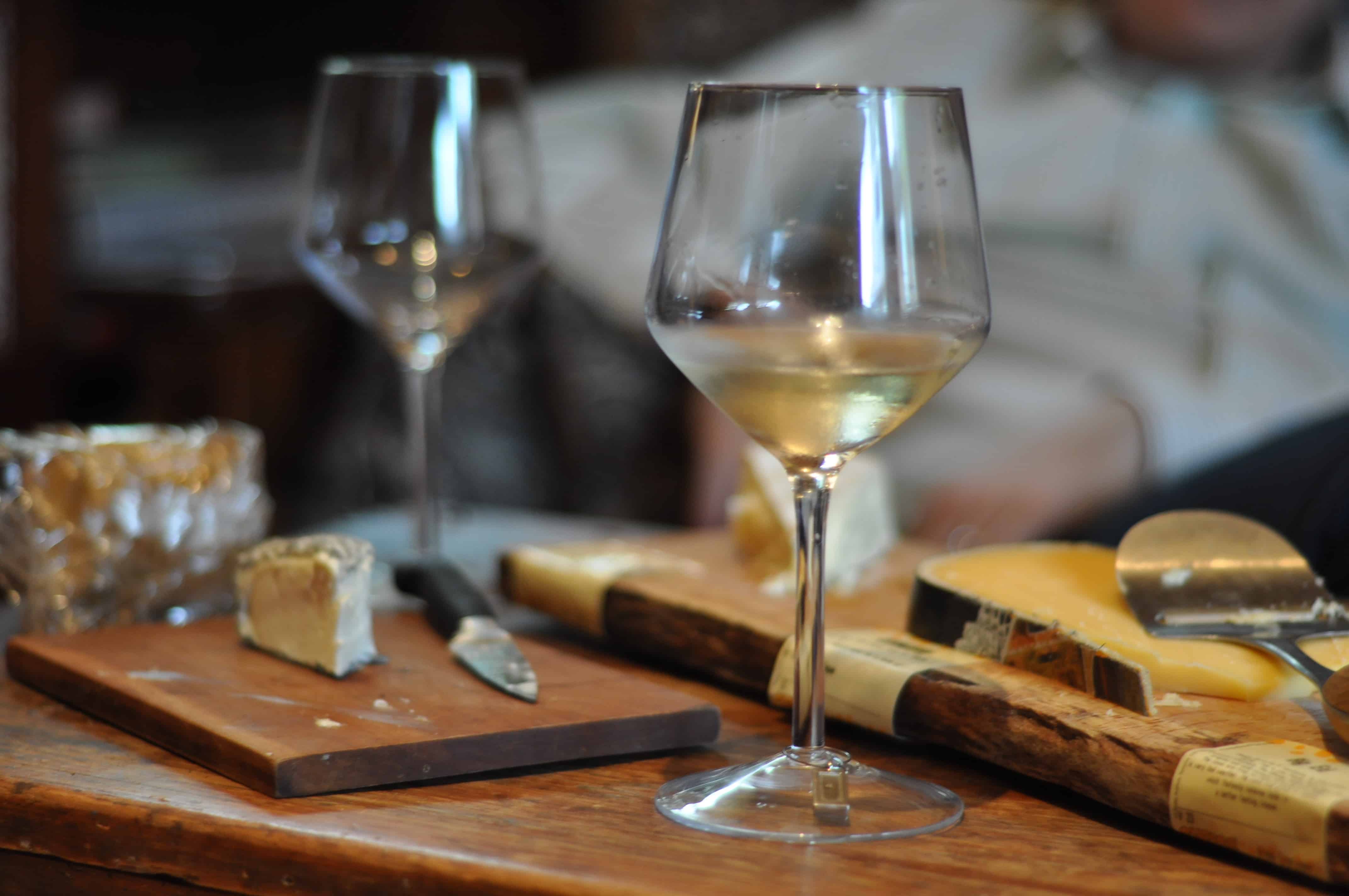
We’ve begun to settle back into school, while the holiday season’s turkey and stuffing have settled into our waistlines. But the end of the holidays shouldn’t mean the end of lavish feasting — at least in the case of wine and cheese.
The perfect wine and cheese pairings can be hard to find, and the wide array of selections can be daunting. Luckily, a newly developed computer program is here to help.
Gary Bader, a professor from the Donnelly Centre for Cellular and Biomolecular Research at the University of Toronto, has created an interactive mapping graphic so that our ordinary lives can be enhanced with the perfect wine and cheese pairings. The graphic is powered by Cytoscape, a computer program originally designed for the visualization of gene networks. The site features nearly 1000 pairings between both domestic and imported wines and cheeses.
The interactive map displays an intricate spider web of connections between 270 cheeses, and about 100 wines. The pairings are derived from the book, Cheese: A Connoisseur’s Guide to the World’s Best, by renowned cheese expert, Max McCalman.
“You might want to either look on the map and place a taste region that you’ve never heard of, or if you know a cheese that you like and want to find similar ones to it, you can find connections,” says Bader.
The map can also be used to search for specific cheeses or wines and their complementary pairs, or similar tasting cheeses or wines to the ones that you enjoy. Additionally, you can further refine searches by inputting a country of origin, type of wine, or cheese type.
Using wine and cheese as the foundation for this mapping graphic has exposed everyday users to the complex field of network analysis.
“Complex network analysis is about looking at a lot of data and representing it in a way that helps you understand how the data is connected and how individual data points are connected within that data,” Bader explains.
This interactive mapping graphic helps the average person relate a common culinary interest to the intimidating world of network analysis, and sheds light on the endless capabilities of scientific programming.
“You might have a general idea of technology that helps you understand data, and in this case, it’s applied to a database of a thousand wine and cheese pairings. Hopefully that analogy helps people think about the idea that they’re looking at a map of wines and cheeses. They may not have seen a network visualization of data before, so it’s an introduction of that concept and can help them think about other ways that they might use that type of map,” adds Bader.
So the next time you reach for that bottle of Cabernet Sauvignon, don’t agonize over the best cheeses with which to pair it. Pull up this interactive map to impress others with your pseudo-impeccable wine and cheese knowledge.