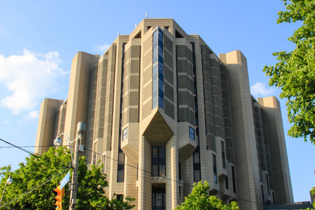
From the Romanesque Revival style of University College to the more modern Leslie L. Dan Pharmacy Building, the University of Toronto’s architecture abides by U of T’s motto “Velut arbor ævo” — “may it grow as a tree through the ages.”
Even though a number of remarkable buildings exist on the three campuses, some nonetheless have bad architecture due to their unappealing appearance, impractical design, or both.
Below, you will find my own personal ranking of the five worst buildings at U of T.
1. Exam Centre
The Exam Centre is neither practical nor aesthetically pleasing. It almost resembles a nineteenth-century factory with its brick exterior and industrial design. Also, the limited amount of seating is problematic — since students always tend to arrive early to the Exam Centre, it should have more benches around. Instead, I find that most students crowd in the lobby during the 10 minutes before the exam starts.
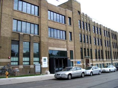
A student’s worst nightmare, both in an aesthetic and academic sense. LOOZRBOY/CC FLICKR
2. Convocation Hall
Convocation Hall is a grand architectural work built in the early twentieth century. Its tremendous dome and neat Ionic style columns are both impressive. However, once you cast aside its magnificent appearance, its indoor classroom design is terrible. The seats are tiny, and students cannot put their arms and legs in a proper position. Those unlucky students who sit on the back bench can only see the front screen by tilting their heads up all lecture long.
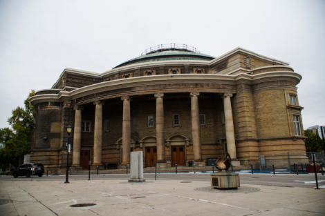
This iconic building puts form over function. SAMANTHA YAO/THE VARSITY
3. Andrews Building
The Andrews Building was designed by John Andrews — the designer of the CN tower — and opened to students in 1966. The building is a classical piece of the Brutalist style. As noted on UTSC’s website, “The building is laid out as an ideal city, with corridors as streets overlooked by interior balconies, and wide stairways and alcoves for spontaneous contact and gatherings.” However, its interior design features long, winded hallways and is generally very complex, meaning that students have to navigate long distances to their classrooms.
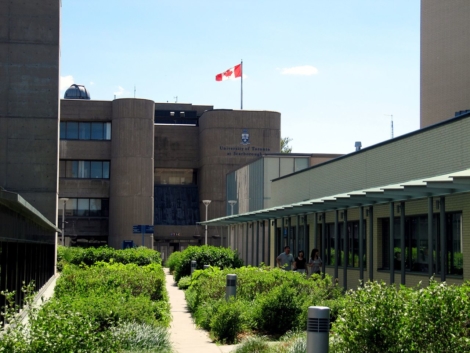
UTSC’s science and humanities wing is confusing and difficult to navigate. LOOZRBOY/CC FLICKR
4. Bahen Centre for Information Technology
The Bahen Centre is the central building of the most technologically centred departments at UTSG. However, its architectural focus is on form over function. For example, while there are large tables to provide sufficient workspace in BA1170, the narrow distance between seats means that students have to shrink into a tiny space.
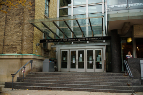
Bahen’s design is certainly nice to look at, but proves impractical for student use. SAMANTHA YAO/THE VARSITY
5. Robarts Library
As the main library and study place of this university, Robarts Library is one of the most familiar places for our students, which also makes it the most controversial building on this list. A previous article by The Varsity, for example, featured a debate between two contributors as to whether the library was the ugliest building at UTSG.
Zach Rosen, who argued that the architecture was indeed unappealing, noted not only Robarts Library’s ugly Brutalist style appearance but also its crowded bookshelves and tiny study spaces, which can make people feel claustrophobic.
However, not all is lost. The Robarts Common, in construction since 2017, should add space for much-needed “daylight and views [from] a five-storey, glass-enclosed addition along the west side.”
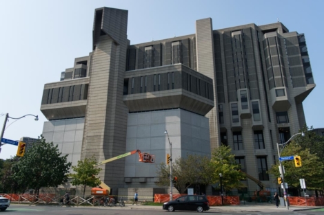
The iconic turkey is getting a makeover. STEVEN LEE/THE VARSITY

