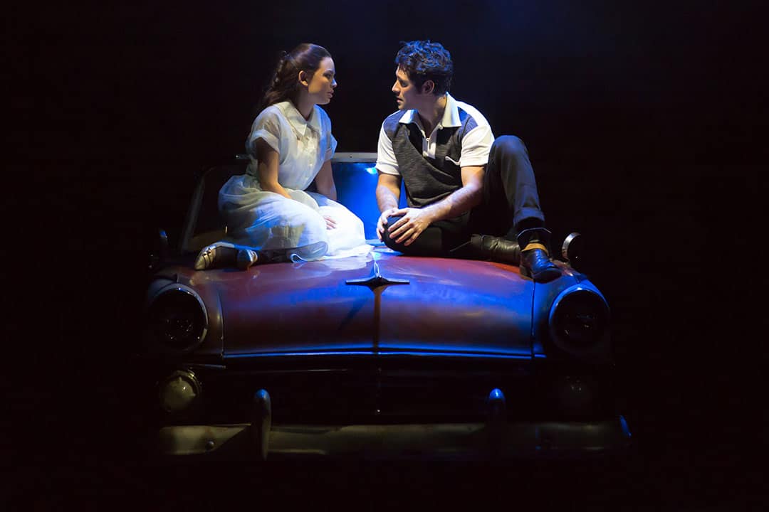
The run of Toronto’s Grease the Musical was recently extended to January 7 at the Elgin and Winter Garden Theatre Centre, which the show attributes to the “amazing support” it’s received from the city. The production, which stars Janel Parrish as Sandy, Dylan S. Wallach as Danny, and Katie Findlay as Rizzo, makes heavy use of onstage technology, including animations and projections.
This is the work of Matthew Haber, the co-founder and managing director of BeSide Digital, a New York City-based experimental design studio. Haber is one of few Americans working on the production, and he travelled frequently back and forth from New York City to Toronto to create the large scale virtual designs that appear in the show. The Varsity spoke to Haber to discuss maintaining a balance between Grease’s 1950s setting, and the modern sensibility provided by the incorporation of technology.
The Varsity: How did you become involved in the production design for Grease?
Matthew Haber: The set designer Paul DePoo, and I had designed a show together a couple years back. When Josh Prince, the director of Grease, brought up a desire for world-building scenic projections, Paul suggested that BeSide and my approach to multimedia storytelling might be a good match for Josh’s vision.
TV: What were some of the challenges involved in the show’s production design?
MH: The story of Grease is really a personal story about young love between the characters. Any time I’m creating physically large-scale projections for a show that has a human-scale story, it’s a challenge to develop a design approach that supports the actors on stage instead of dwarfing them and their storytelling. For Grease, we had to develop compositional and stylistic techniques for the integration of the projection design to ensure that we were most effectively melding our work with the action on stage.
TV: Were you ever concerned about anachronism in using projection or other technology in the show and its setting in the 1950s, or whether this would distract the audience?
MH: Absolutely. We worked really hard to develop an aesthetic sensibility for the show that would help build the world of working class 1950s Chicago in a way that felt analogue and authentic instead of cold and digital. Typically we might rely heavily on techniques such as 3D animation, but for Grease, my team collected thousands of period images and videos over several weeks of research, and those formed much of the visual foundation of the design and really guided the way we constructed the computer-generated visuals that we do have. For example, in “Grease Lightning,” the characters are catapulted through 1950s Chicago surrounded by a complex CGI cityscape, but rather than looking harsh and animated, we developed a look for the sequence that feels more like a vintage postcard come to life.
TV: What sets Grease apart from other shows you’ve worked on, and what should potential playgoers know about the show?
MH: The vast majority of the shows I’ve designed in the past are new plays and musicals, so we’re really working from a clean slate in terms of the visual and narrative vocabularies of the production. Grease carries with it the baggage of an untold number of stage productions as well as the iconic film. Josh, the director, and my fellow designers and I have worked to respect that heritage while also trying to create a production that feels simultaneously true to the show’s roots and fresh for a contemporary audience.
TV: Finally, what is your favourite song from Grease?
MH: Definitely “Grease Lightning,” but that may be because of all the times I listened to it while we created animation for it.


