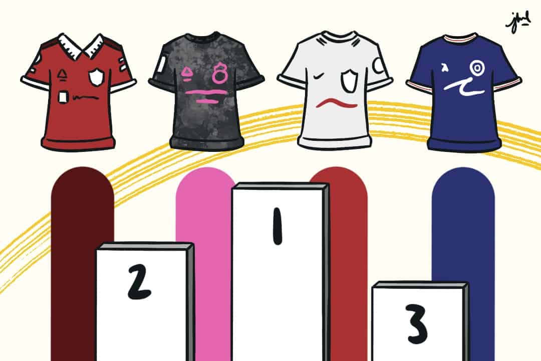
A new Premier League season means new kits! I’ve placed each team’s home kits into eight tiers, going from worst to best.
Tier eight: Burn it
Only one team belongs here — Leicester City. The collar is oversized, and it doesn’t even go all the way down the neckline. Also, why are the logos gold? Why add a third colour? Horrible.
Tier seven: Dull
This Wolverhampton Wanderers kit looks nearly identical to last season’s kit and is just as dull. The second team here is Aston Villa. Nothing is appealing here either — simply boring.
Tier six: Bad sponsor
Everton’s sponsor is oversized, in a goofy font, and has a “.com” — that should be banned.
For Chelsea, the sponsor is big and just obnoxious — a number on both the back and front doesn’t look slick. It’s a shame, considering I liked the collar.
For Newcastle, the blue colouring of the sponsor doesn’t match the blue on the team’s logo and looks out of place next to their classic black and white stripes.
Tier five: They tried?
Both Brighton and Bournemouth go bold here and ditch their stripes, but it’s a mixed bag. Brighton’s kit now has two white stripes surrounded by a block of blue — in short, there’s now a giant white “H.” Bournemouth has gone for more of a zig-zag pattern, but it doesn’t look very clean.
Crystal Palace has made their red and blue stripes more scribbly. It looks a bit messy, but I actually like it. Yet, the kit is identical to the 2021–2022 away kit for the Croatian team Hadjuk Split. Is it plagiarism if they were both produced by Macron?
Tier four: Decent
Tottenham Hotspurs have questionably decided to display their sponsor in red, the colour of their North London rivals. The centred logo doesn’t look nice either, given the irregular shape of Tottenham’s logo. The rest of the kit is plain.
This Liverpool kit also looks too conventional — they need something. Minimalism does make it somewhat unique, so it’s not horrible.
Fulham, Leeds United, and Arsenal have created kits that all look similar. Suspiciously, they were all made by adidas. They’re generic, but that’s not bad. Additionally, Fulham does have a nice burgundy wave pattern on the cuffs and collar, and Arsenal has a nice lightning bolt pattern on their collar that I love.
Tier three: The shoulders!
Southampton has abandoned their traditional red and white stripes and gone for a giant central block of red over a white background. It’s a nice variation, especially with the centring of the logo, although the arrows on the shoulders shouldn’t be there.
Manchester United have produced a kit that’s reminiscent of their glorious past. The collar, with a neat triangular design and crested logo, immediately reminds fans of Eric Cantona. Yet why go for black stripes on a red and white kit?
West Ham sticks by their trusty claret and blue colours for their kit but has added something cool and unique on the shoulder. I’m not entirely sure what it is, but it looks good.
The Hammers have stuck to their strengths and added something fresh as well.
Tier two: Brentford
Brentford has a tier for themselves because they haven’t changed their kit, to reduce the team’s environmental impact and also save fans’ money. The jersey features a generic stripe, a star that looks like it’s made out of hair, and a disgusting sponsorship logo. The kit on its own wouldn’t rank this high, but their decision and the motivation to keep their kit are admirable enough to propel them upwards.
Tier one: Potential classics
Nottingham Forest is in the Premier League for the first time in my lifetime and they arrive in style. There is no sponsor, so it’s immediately unique. The sleeves and collar have a subtle pattern and a shade of red darker than the rest of the kit that looks great.
Lastly, my favourite kit is Manchester City’s. There isn’t anything here I dislike. The burgundy on the collar and sleeves is great and so is the centre of the logo. Part of its greatness also comes from how good this team is. Most kits become memorable because of the players wearing them, and with players like Kevin De Bruyne and Erling Haaland wearing it, this Manchester City kit is clearly destined for success. Good job, Puma!
And here, eight tiers later, I’m done.


