Nestled between Innis College and a sparse row of townhouses is bpNichol Lane, a narrow, concrete road. I have passed by this unassuming little street nearly every day for the past four years, thinking it was nothing more than a deserted alleyway. But now, amidst the gasping winds of an unseasonably rainy January, I head down the street for the first time in search of Coach House Books.
The small publishing company is located at the end of bpNichol Lane in a small brick building that was once used to store horse-drawn carriages. I can hear the hum of a printer through its blue doors and walk along a pathway that leads to the front of the premises. Two hulking antique printing presses greet me as I step inside. At the top of a narrow staircase is a cozy room with a large window and creaking wooden floors. Densely packed bookshelves crawl across the walls, reaching the tips of the triangular ceilings. A plush armchair rests by the window beneath a hanging sign that proclaims it the “magical sleeper chair.”
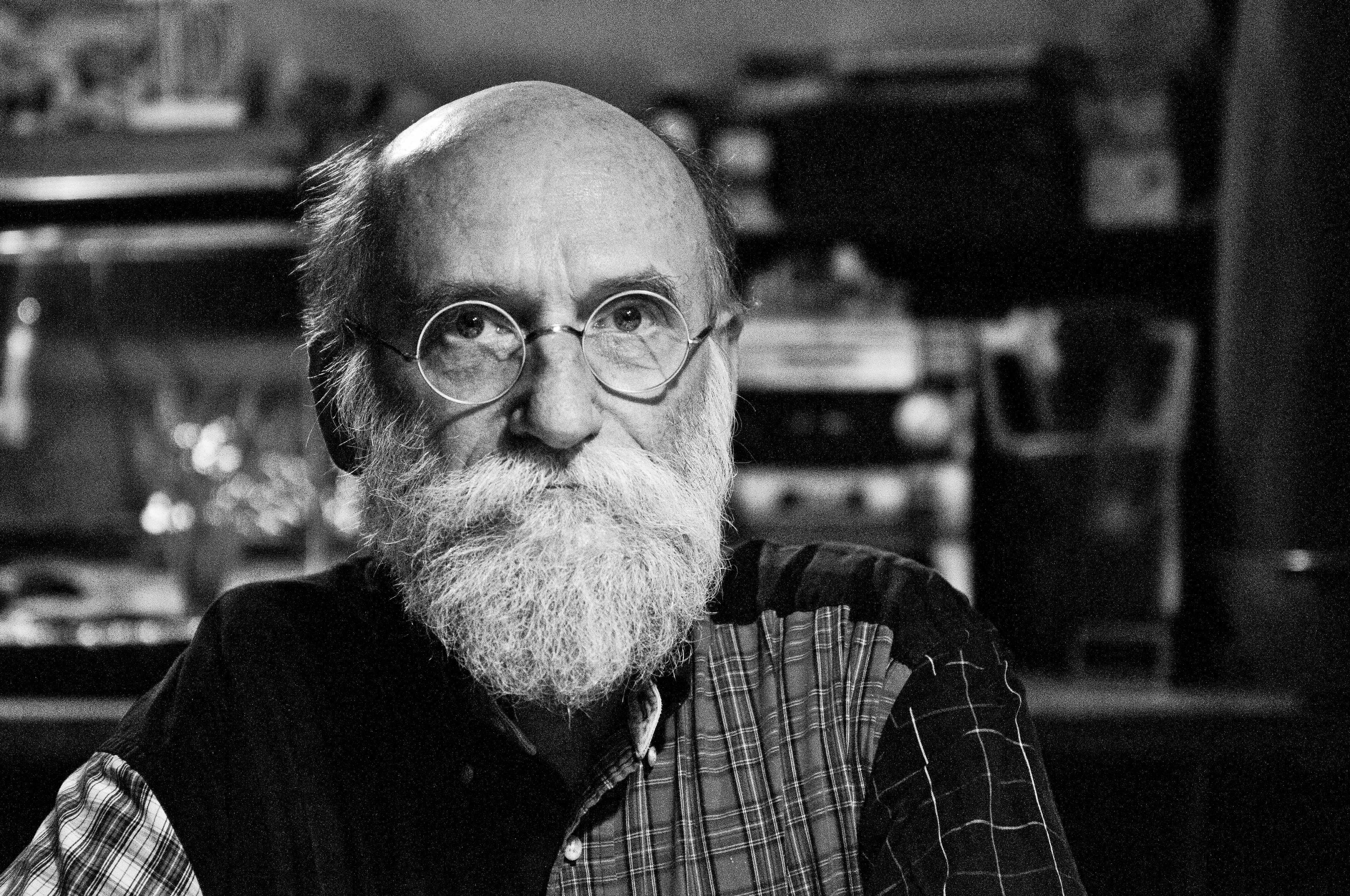
I have come to Coach House Books to talk to Stan Bevington, the company’s founder and long-time publisher, about the evolution of book design. Although its appearance might suggest that Coach House is nothing more than a quaint printing shop in a secluded enclave of the U of T campus, it is in fact a respected and established authority in the Canadian publishing industry.
[pullquote]“Our shop was the first to buy Helvetica … when it first came out,” he says. “[But] the lead and the brass moulds for the type were so expensive, we could only have two typefaces.”[/pullquote]
Coach House has been at the forefront of technological innovations in publishing and printing since its foundation in 1965, and it has printed the works of many famed Canadian authors, including Margaret Atwood, Anne-Marie MacDonald, Anne Michaels, and Michael Ondaatje. Bevington himself has been honoured with a slew of awards recognizing his contribution to the field of book art, including membership to the Order of Canada.
As I sit down at a wooden table near the stairwell, Stan walks into the room, carrying a large stack of books. He takes a seat across from me and begins to tell me about the early days of Coach House. Suddenly, he slaps the surface of the table. “I made this table!” he exclaims and then laughs. “And these benches too!”
When Stan began publishing with Coach House in the ’60s, the process of printing books was almost as painstaking a task as crafting furniture from scratch. Each word of a book had to be typeset by hand and each page printed manually using the antique printing presses that now sit in the entrance of the building.
“[At that time], a lot of printing was done with letterpress — that is, little lead letters that were raised — and the top of the letters got [brushed with] ink, and then that ink got pushed into the top of the paper,” Stan explains. “So we had to have a collection of little lead letters.”
A few years later, Coach House purchased a photo-offset lithography machine, which allowed images to be transferred photographically to aluminum printing plates. Oil-based ink adhered to the images on the plates, which were then used to print the pages of a book.
“Being starving students as we were, I bought a $5 camera at an antique store, which is that one right over there,” says Stan, gesturing towards a box camera nestled into one of the shelves on the wall behind me. “That camera was used to photograph illustrations and turn them into negatives, and then the negatives got exposed to the photo-offset aluminum plates that would print the illustrations.”
He shows me a book that Coach House printed in 1967 on the early work of Jack Chambers, a contemporary Canadian artist whose paintings are now on display at the AGO. On one page, a black and white picture is positioned between two paragraphs of type. Stan explains that these paragraphs were typeset by hand, photographed, and then pasted next to the picture. The composite image was photographed once again, transferred to an aluminum printing plate, and finally run through the printing press.

BERNARDA GOSPIC/THE VARSITY
In the 1960s, this was cutting-edge technology. According to Stan, offset lithography was a tremendous step forward in the publishing industry because it “drastically liberated” the process of creating printing plates. But the text of a book still had to be typeset by hand, which left publishers relatively restricted in other areas of design. As Stan thumbs through additional books that were printed using offset lithography, he laughs and points out that they are all set in the Helvetica typeface.
“Our shop was the first to buy Helvetica … when it first came out,” he says. “[But] the lead and the brass moulds for the type were so expensive, we could only have two typefaces.”
Oh, how the times have changed. Since switching over to new printing presses in the early 1980s, Coach House has digitally typeset all of its books. The advent of digital printing technology was also accompanied by a plethora of new typefaces, giving Coach House the freedom to both select and create fonts that would enhance the overall design of its books.
“We look for a font that’s appropriate for the job at hand,” says Stan. “We have an almost unlimited range of choices. What we’re more proud of is having encouraged Canadian type designers to design type.”
Stan walks over to one of the bookshelves and pulls out a catalogue that Coach House printed for the Fisher Rare Book Library. He flips through the pages so I can see the font.
“This [catalogue] was the first showing of a type called Cartier Book,” he explains. “It was used for the Canadian Bill of Rights, and it’s used for historical plaques in Canada, but we at Coach House used it for many, many books. We helped the designer polish up the design of the face … until finally it [was established as] a really solid typeface.”
Advances in printing technology have also dramatically altered the nature of book cover design. During the years that Coach House used a photo-offset machine, it was incredibly difficult to print a book cover using more than two colours of ink. Stan excitedly shows me the fairly ambitious cover of Michael Ondaatje’s Rat Jelly, a book of poetry that Coach House published in 1973. Made with four different colours, it features a rather sinister looking baker holding up a tray of cakes. Each colour is marbled with lighter shades and outlined thickly in black, making the cover resemble a stained glass window. It’s a lovely piece of book art, but Stan tells me that it took an entire week of darkroom work to create the four-colour aluminum plates required to print the cover.

BERNARDA GOSPIC/THE VARSITY
Stan pulls yet another book out from the pile sitting next to him on the table, this one made entirely with a digital printing press. About half a dozen colours are swirled together in the background of the book’s glossy cover. The pattern glides neatly around the cover’s crisp white lettering. In fact, Coach House’s digital press is so accurate that it was able to print the background design around the outline of the white lettering without any colour bleeding into the text.
Because Coach House can now print such intricate designs with relative ease, the staff are able to focus their efforts on creating covers that encapsulate the essence of a book’s content.
“We’re now able to make full colour covers on anything we want,” says Stan. “We’re usually looking [for a design] that will, at a glance, describe what a book is. If you pick up a book, look at the front cover, look at the back cover, and if you can get the gist of what the book is about, that’s a win.
“Each one of the books reflects the taste of the author, reflected through the professionalism of a good editor and a good typographic designer,” he adds. “But generally, we try to make a book cover that has individuality. There’s not a particular house style that makes them look similar.”

To illustrate his point, Stan shows me a book that describes the holdings of Chinese studies in the U of T libraries. The cover is floppy, and the paper inside is so thin that it could only be printed on one side.
“This book was made [with this paper] because in the Oriental way, they printed on rice paper,” says Stan. “So we chose the thinnest paper [available].”
He tells me to turn to page 32 of the book, where there is a beautiful Chinese illustration coloured with delicate strokes of red ink.
“In the history of Chinese printing, they only had that red, which was a vermilion pigment,” Stan explains. “So I printed this book with black and vermilion [ink].”
Although Stan has always welcomed the progressions in printing technology that have allowed Coach House to expand its repertoire of book design, he admits to being somewhat baffled by the ever-shifting nature of the industry.
“I think of how reassuring it must be for a craftsman who’s a bricklayer, because the materials haven’t changed. We’ve been on quicksand. We have to keep making the things look like books, but they’re always made in a different way.”
Yet there are some aspects of book design that Stan refuses to change. While most publishers now print their books on recycled paper (“post-consumer junk,” as Stan calls it), Coach House still uses the same type of paper that it commissioned from a Quebec paper mill during the ’70s. This paper is made from fresh, young trees and sized to fit the Coach House printing presses in order to cut down on waste.

BERNARDA GOSPIC/THE VARSITY
“We asked [the mill] to make the paper a little thicker … and we asked them to put a laid finish on it,” Stan says, holding a book up to the light so I can see the grids of parallel lines on its pages.
“Why?” I ask him.
He looks at me for a moment, as if wondering why I would ask such an obvious question. “’Cause it’s a tradition,” he replies, “A tradition in papermaking.”
As I walk back down bpNichol Lane later that day, I catch a glimpse of Coach House’s digital printing press through the windows at the back of the building. I can’t help but smile at the thought of such a cutting-edge piece of technology whirring busily away in the back of an old carriage house, and I find myself hoping that some aspects of Coach House Books will always stay the same.